
Image Sequence Assignment

Colour
This sequence uses an analogous colour scheme. The soft brown yellow and green tones run through each image and create a sense of stillness. The colour palette creates a calming and relaxed feeling.
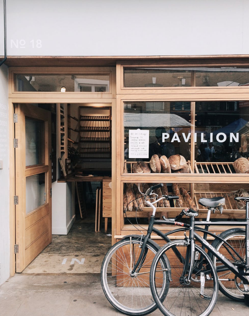
Symmetry
The sequence plays on asymmetry. The bikes and bread play against the negative space of the open doorway. The row of barstools draw your attention from the negative space on the right. The large suitcase plays off of the angled suitcase beside it.
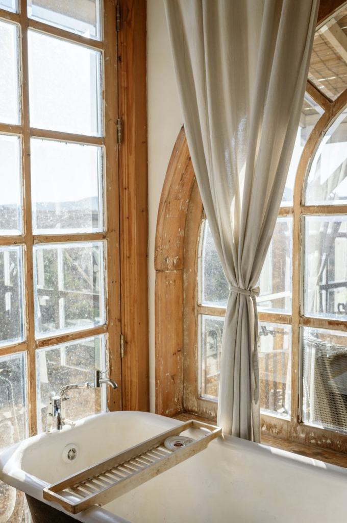
Texture
The sequence introduces many textures. The painted brick, the soft fabric curtains and rough wooden window frames, as well as the pile of leaves and leather suitcases all add warmth and and a sense of depth to the sequence. All of the textures give an overall vintage feeling to the images.

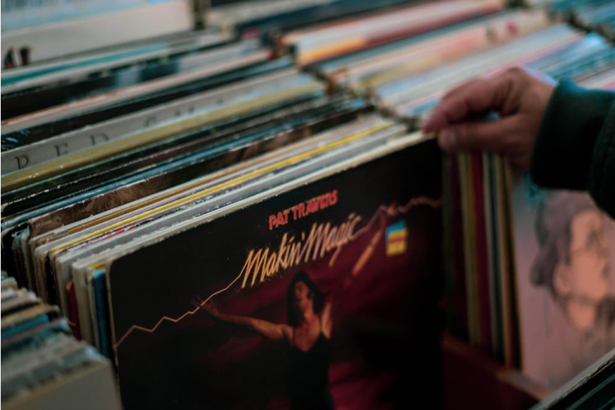

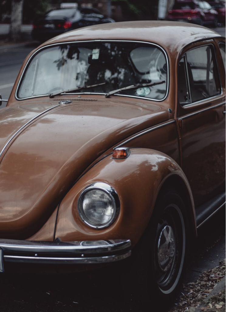
Line
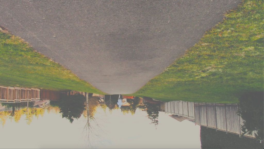
This sequence uses leading lines to guide your eye. The angle of the motorbike along with the curb and lines of the road lead your eye into the depth of the image. The rows of records guide you to the hand and even the line of the shadow draws your attention to the record player.
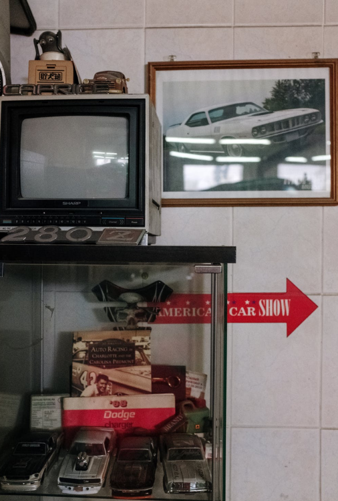
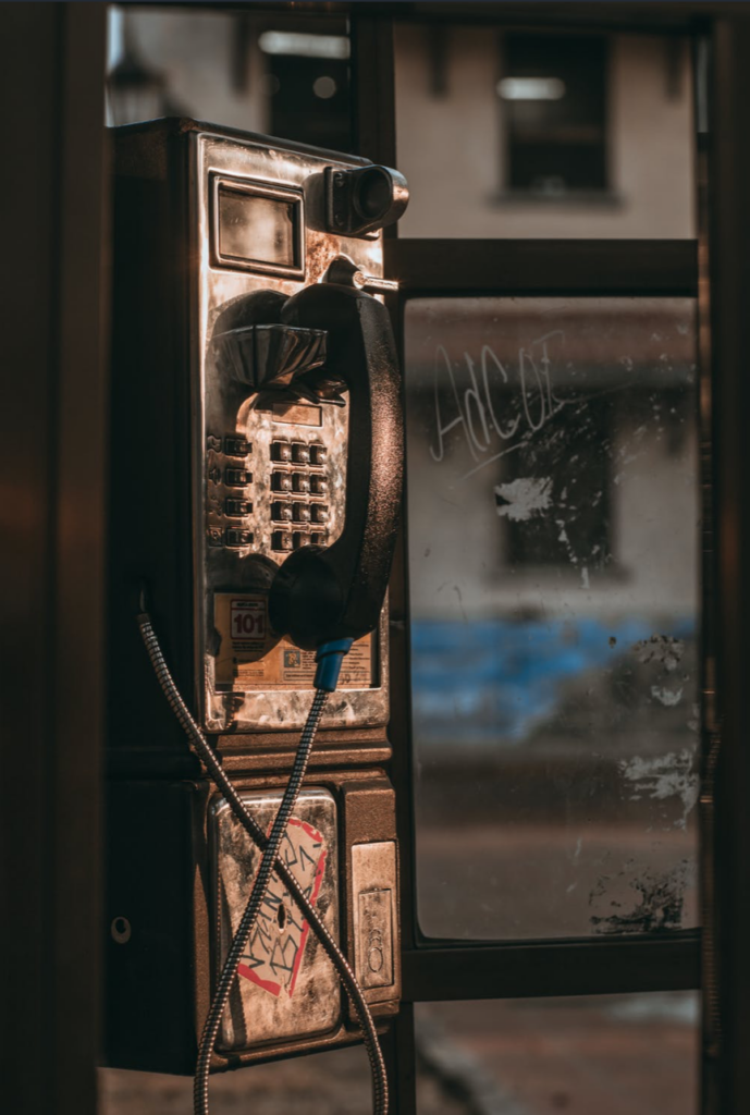
Focal point
The sequence has a strong use of the rule of thirds. Each image places focal points in the rule of thirds. the hand perusing records, the motorbike and the gleam of light on the top portion of the telephone all dry your attention to a focal point but then allow your eye to wander to the rest of the depth of the image, using the rule of thirds.
Colour
This sequence uses a complimentary colour scheme in most of the images, which lends to the overall sequence. The colour palette is subtle but the hints of blue, red, orange and green play off of each other and add a subtle lively energy to the sequence.
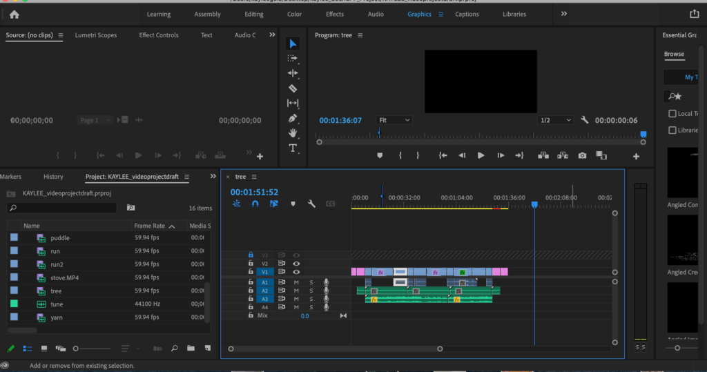
Tech. Exercise: Video Basic Editing
In this tech exercise we learned the basic editing with Premier Pro. We got familiar with the different tools, including the selection tool, track selection forward tool and ripple edit tool. We also tried out some transitions.
Video Project Proposals
1.
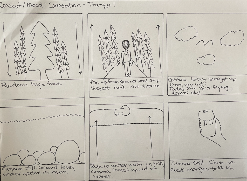
For this video I would collect sounds such as running on gravel, flowing river sounds and birds. I would also use ambient sounds and a ticking clock sound.
2.
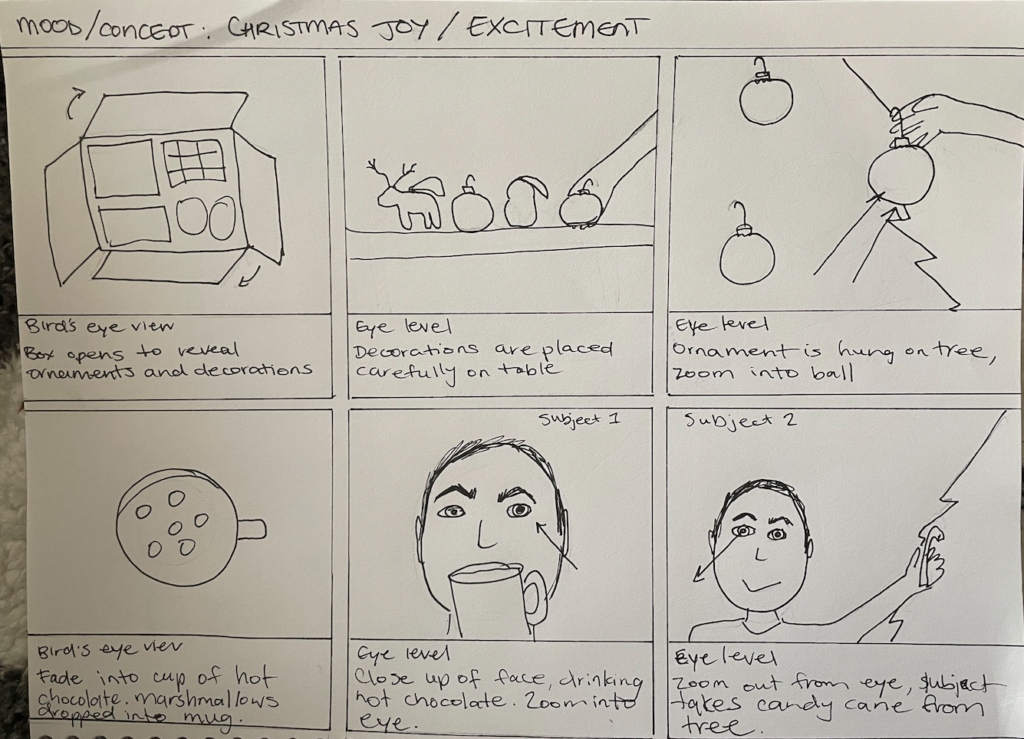
For this video I would collect sounds such as a boiling kettle, spoon stirring in mug, and cardboard box opening. I would also use a jingle bell sound and other ambient Christmas sounds.
Tech Exercise- Video FX:Colour + Blends
The Fits: A Review
The central themes in The Fits are isolation and fear and determination. The main character Toni seems isolated from her peers in the beginning of the film as she longs to join them in dance. Fear becomes a factor as Toni’s fellow dancers begin to suffer episodes of a mysterious illness, and she becomes once again isolated by the fact she hasn’t experienced this yet, as more and more of her peers have. Throughout the film Toni shows immense determination in her trainings to accomplish what she desires.
I was captivated by Maine as he shows great determination, work ethic and responsibility. He is also very encouraging to his younger sister. Of course I was captivated by the main character, Toni. Toni shows great determination in working towards the things she wants, but you also wonder what she is feeling throughout much of the film and want to know what she is thinking.
The colour blue is used a great deal throughout the film. Blue is sometimes associated with the divine and as the movie progresses you can make that connection, given that the girls have serene, out of body experiences. Bland colours such as grey are used to convey the mundane feeling Toni has, while training for boxing, while wanting to join the girls in dance. Toni begins wearing more purple which is echoed in the other girls clothing as she becomes more connected with that group of people.
The architectural spaces that create symbolism to me are all of the enclosed stairways and fenced in areas that Toni finds herself in which symbolize her feeling of being trapped or being confined to something she doesn’t want to be doing. Toni being on the outside of doorways, looking in symbolizes her feeling of being an outsider, as shown in the beginning of the film, watching the dancers and later in the film she is on the outside looking in on her brother, showing her now being disconnected from her old group, the boxers. Many points in the film show Toni in large rooms, expressing her feeling small or out of place.
Overall I enjoyed The fits, it went in a different direction than I thought it was going to go and kept me interested. I’m left wondering what were these ‘Fits’ and what will happen next.
Title Sequence Review: Romanzo Criminale
The mood of the title sequence is tense and stressful. The text is given a treatment of the first word being only outlined and the second word is filled in. Multiple credits appear together at the same time and are quite large and take up quite a bit of the screen. I think having some of the word being outlined, and showing the background scene through the lettering allows the text to take up more space without taking too much away from the film in the background or feeling too intrusive on the screen. The text is placed in such a way that it is drawing attention to the focal point in the scene that is playing. Other elements that stand out in the time sequence are the repeating money counting. The money stacking up and revealing and playing a scene on the side of the bills was a very interesting treatment and creates a lot of visual interest. The music in the sequence also does a good job of conveying the tense mood and building up anticipation and intensity.
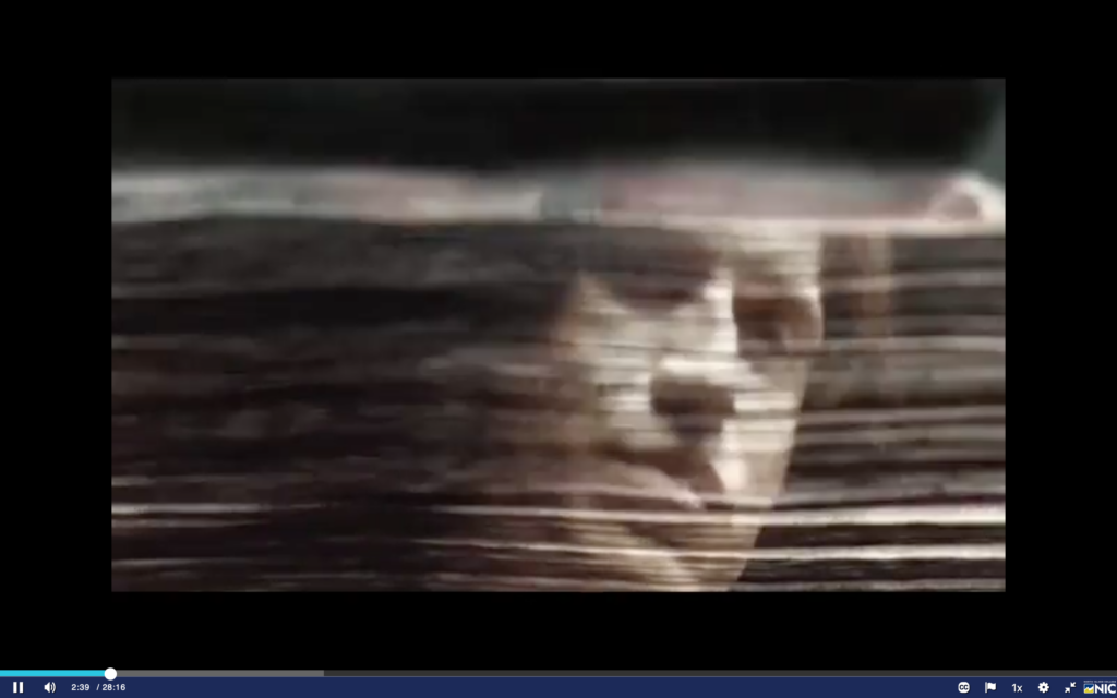
Title Sequence Review: Justified
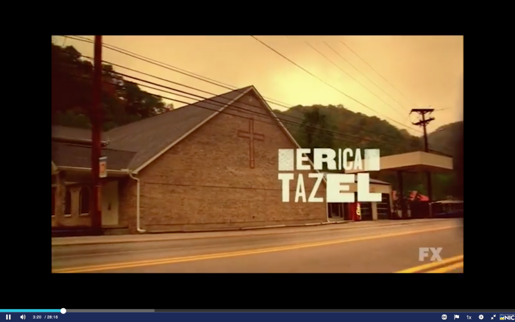
The mood of the title sequence for justified is gritty and mysterious. The text is given a treatment of having a subtle texture of tree rings. I assume this is foreshadowing of the subject of the show/film or has something to do with the location of the film. The text also has some moving parts which draws attention to it and makes it work well with the quick moving scenes in the title sequence. Each credit text displays over several different frames. Other elements that stand out in the title sequence is that the frames are very quick changing. There are quick transitions and interesting wipe transitions. A lot of the clips have the camera moving, either running along with a subject or driving along which leads me to believe that the show includes a chase or someone on the run. The clips also have a texture to them which plays with the overall gritty feeling of the sequence. The music conveys that this takes place somewhere out in the country.
TECH exercise: Titles
Video Draft
Video Project
For this video project I wanted to use the idea of connection and play on the meaning of 11:11 which is often depicted as meaning interconnectedness. I took video clips of natural elements and paired them with more human and man made things. I tried to find connection through shape, colour, and movement to create a flow between the clips. I used the element of the rule of thirds through a lot of the shots to create interest and draw attention to the subject. I used the element of line and shape to connect different shots and played with different points of view to give visual interest. I used the ticking clock sound throughout the video to create a meditative focus and layered a soft melody with a corresponding sound to each clip to create a layered sound effect, while creating a flow through the video. I used the clip of the clock throughout the video to create a rhythm and continuity. I edited the colour of each clip to give a softness to the picture quality and create a cohesive feeling.